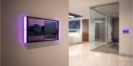
Wall controls are small details that can change the whole feeling of a room.
A beautiful wall can be ruined by too many switches, badly aligned keypads, awkward touchscreens or controls placed where nobody naturally uses them. At the same time, hiding controls too aggressively can make the home frustrating for family, guests and staff.
This is why keypad and touchscreen placement should be treated as an interior design decision as much as a technical one.
In a Crestron Home project, the aim is not to put a touchscreen everywhere. It is to give the homeowner the right control in the right place, with the least possible visual noise.
Start with how the room is used
Before choosing keypads, touchscreens or switch positions, ask what the room actually needs to do.
For example:
- Is this a daily living space?
- Is it mainly used for entertaining?
- Will guests use it without the homeowner present?
- Will staff need simple control?
- Is the room part of a larger open-plan area?
- Does the client want physical control, app control or both?
- Are there lighting scenes, audio zones, curtains or climate controls involved?
The answer changes the wall layout.
A formal lounge may only need a simple lighting scene keypad and hidden app control. A cinema room may need dedicated scene control near the entrance and remote control from the seating position. A main bedroom may need bedside scenes, curtain control and a clear night-time pathway mode.
Controls should follow behaviour, not habit.
Keypads should replace clutter
Traditional lighting layouts can produce large banks of switches. One switch for downlights. One for pendants. One for feature lighting. One for exterior lights. One for passage lighting. One for dimming. Then another control for curtains or audio.
That is exactly where smart lighting control can improve the design.
A well-planned keypad can reduce wall clutter by replacing several switches with scenes such as:
- Welcome.
- Relax.
- Entertain.
- Dining.
- Pathway.
- All off.
This is one of the biggest visual advantages of lighting control. The room can have more lighting detail without needing a wall full of switches.
But the keypad must still be understandable. If every button name is clever but unclear, the client will stop using it.
Simple wins.
Touchscreens should have a reason
A Crestron touchscreen is useful in the right location.
It can give access to lighting, audio, climate, cameras, gates, intercom, scenes and room control from one place. It can be excellent at an entrance hall, kitchen, main living area, master suite or entertainment zone.
But touchscreens should not be added just because the system is premium.
In many rooms, the Crestron mobile app or a simple keypad is more appropriate. We have written separately about where touchscreens and app control each make sense, because this is one of the areas where cost can be wasted if nobody asks how the home will actually be used.
The best touchscreen location is usually:
- Easy to reach.
- Naturally visible.
- Not fighting artwork or feature walls.
- Not hidden behind a door swing.
- Not placed where glare makes it difficult to read.
- Connected to a real control need.
If a touchscreen is only there to impress someone during handover, it probably does not belong there.
Align controls with the room architecture
Interior designers care about alignment because alignment creates calm.
Smart home controls should respect that.
Keypads and touchscreens should be coordinated with:
- Door frames.
- Light-switch heights.
- Joinery lines.
- Wall panelling.
- Bedside positions.
- Artwork.
- Mirrors.
- Stone cladding.
- Feature wallpaper.
- Wall lights and sconces.
If controls are added late, they often land in visually awkward places. If they are coordinated early, they can sit comfortably in the architecture.
This is especially important in homes with imported switches, designer plates, timber panelling or stone feature walls. The automation team needs to know the final wall finish before boxes and conduit are locked in.
Bedside control needs careful thought
Bedrooms are where poor control design becomes obvious.
The client should not need to get out of bed to turn off the last light. They should not need to open an app for a basic night scene. They should not have to remember which switch controls which circuit in the dark.
Good bedroom control may include:
- Master off.
- Reading lights.
- Pathway lighting.
- Curtain or blind control.
- Climate adjustment.
- Security or panic integration where appropriate.
- Audio control if the room has speakers.
The exact layout depends on the furniture plan. If bed position, headboard design and bedside tables are still changing, keypad positions should not be guessed.
This is where the interior designer’s information is essential.
Staff and guests need obvious controls
A luxury home is often used by more than the homeowner.
Family, guests, house managers, domestic staff, security staff and maintenance teams may all interact with parts of the system. If every control decision assumes the owner is holding a phone, the system becomes awkward.
Physical controls still matter.
The guest suite should be easy. The entertainment area should be obvious. Staff areas should have practical controls. Entrance and exit scenes should make sense without explanation.
This does not mean adding more buttons everywhere. It means making the right controls available where people naturally need them.
Decide the wall before the electrician starts
The worst time to discuss keypad placement is after chasing, conduit and wall finishes are complete.
By then, every change becomes expensive or visually compromised.
The smart home team should review the control layout with the architect, interior designer and electrician before first fix. That review should confirm:
- Which walls receive controls.
- Control heights.
- Box sizes.
- Conduit routes.
- Plate finishes where known.
- Touchscreen power and data.
- Door swing conflicts.
- Feature wall constraints.
That small coordination step prevents a lot of frustration later.
The best control is the one the client uses
A premium automation system should not make the client feel like they need training every time they enter a room.
Good control design feels natural.
The wall is clean. The buttons make sense. The touchscreen has a purpose. The app is there when deeper control is needed. Guests can use the room. Staff can reset it. The homeowner does not have to think about the technology.
That is where interior design and smart home design meet.
The wall should look right.
The room should work right.
Both matter.